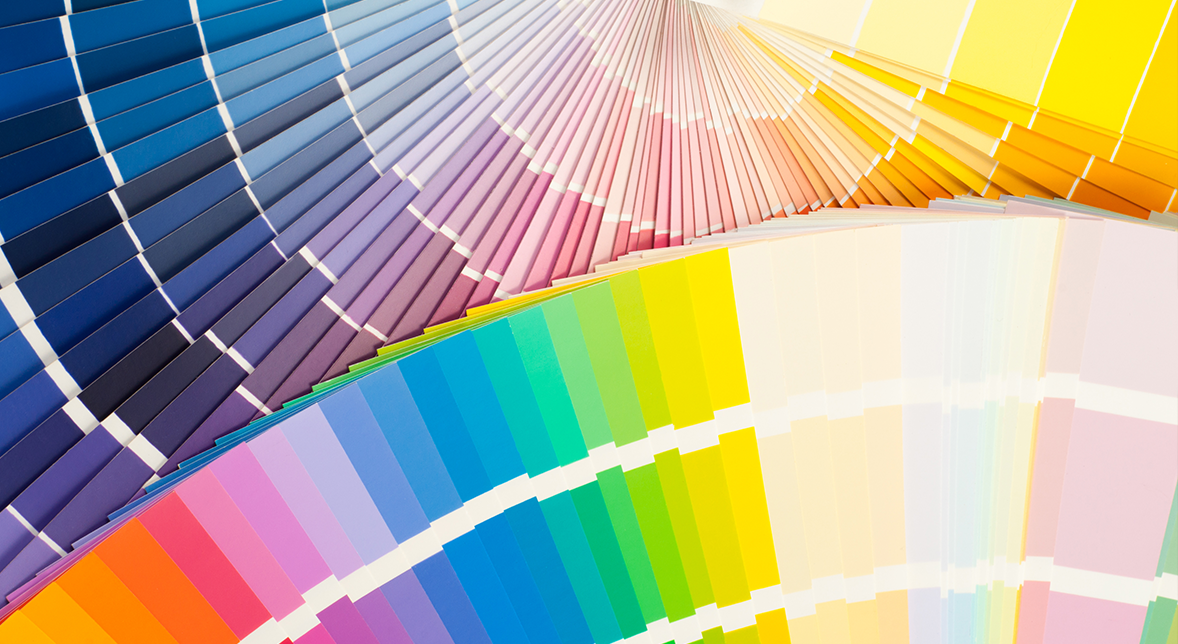
We’ve all heard the expression “Don’t judge a book by its cover”. However, when it comes to a product, the color and aesthetics of the packaging is what sets it apart form all others. Color is the most crucial attribute in packaging, making the final product stand out. The appropriate selection is an art as it might help determine the success of a product. Like a peacock strutting its colors, the palette you choose can help boost your brand’s image.
The meaning behind colors

Each color has been known to evoke certain emotions along with it as it carries psychological insinuations, therefore influencing the purchasing decision of a consumer. Hence, whether you are designing a package, or simply buying a product, it’s important to keep in mind the feelings induced by each of the colors:
- Blue represents integrity, honesty, and trust.
- Red represents excitement, passion, and contemporary.
- Green represents eco-friendliness, environment, and freshness.
- Purple represents uniqueness, luxury, and creativity.
- Yellow represents warmth, energy, and joy.
- Orange represents attraction, engagement, and youthfulness.
- Pink represents tenderness, sensitivity, and sympathy.
- Black represents boldness, elegance, and sophistication.
- White represents purity, hope, and simplicity.
- Grey represents stability, security, and strength.
The colors that are trending
Like every industry, there are fads that manufacturers and consumers go through depending on what is popular in the market that year. The same theory is holds true for packagingand the colors that apply to them.
- Soft neutrals have made a resurgence in the design and packaging world due to their ability to create a sense of relaxationin consumers.
- Black and white, the ying and yang of the color pallet, are trending again. Well, they’ve never really stopped. The reason they have been so popular over the years and continue to do so is because of the sophistication and simplicity they evoke.
- Gradients of color are notorious for adding depth to a package while still focusing on the product itself. They attract the customer without distracting them from the brand itself and what it evokes.
- Green, the color of sustainability, is an ever-growing trend. As people become more conscious of the effects of our everyday habits on the environment, so do manufacturers and brand owners. To show their values when it comes to the environment, many brands are opting to not only use sustainable materials, but also include green colors to market their eco-friendly products.
In a competitive market that is exponentially growing, it is imperative to not only be strategic in the products you put on the shelf, but also in the message you portray through the packaging. It can sometimes be overwhelming to choose from a large variety of options. Luckily, with the help of an experienced team like the one at Netpak, you can get the advice and help you seek for your packaging needs, from pre-press to graphic services.
Netpak: Printed Folding Carton Experts. Contact us today for a quote: sales@netpak.com | CANADA – USA 1-866-399-8544
